

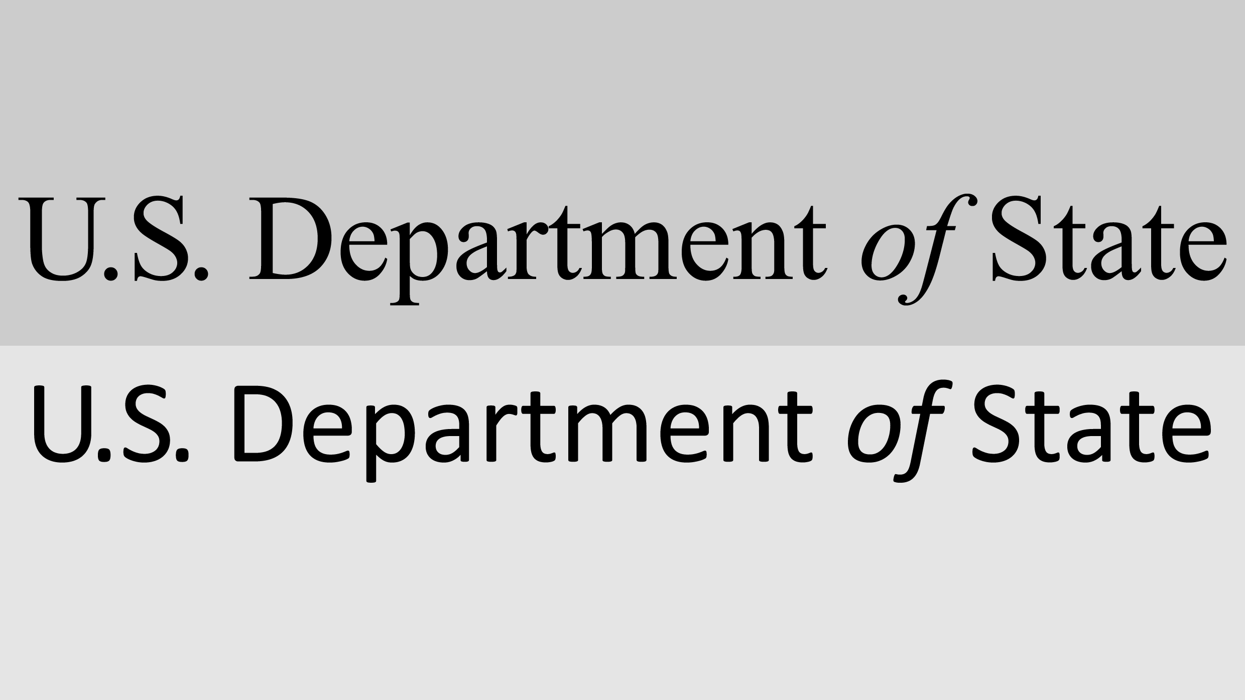
Calibri and Times New Roman have been at war for years. And now the two fonts are once again pitted against each other after the U.S. State Department declared it will be swapping its current official typeface, Calibri, for Times New Roman. It’s a full-circle moment, considering the State Department ditched Times New Roman for Calibri in just 2023.
Secretary of State Marco Rubio wrote that switching to Calibri was “wasteful” and “achieved nothing except the degradation of the department’s official correspondence” in an internal department memo obtained by Reuters and The New York Times.
The type designer behind the sans-serif font Calibri calls Rubio’s decision “hilarious and regrettable.”
Lucas de Groot designed Calibri in 2007 specifically for readability on computer screens. The width and curvature of its simple letterform was optimized to be easy to read, and it replaced Times New Roman as the default font in Microsoft Office in 2007 (before being replaced by Aptos in 2023).
In 2023, the State Department decided to replace Times New Roman with Calibri for all official communications and memos. It was a bid for greater accessibility throughout the organization. At the time, then-Secretary of State Antony Blinken said that Times New Roman “can introduce accessibility issues for individuals with disabilities who use Optical Character Recognition technology or screen readers.”
Not everyone was happy about the decision, but de Groot believes it was the right choice.
“There were sound reasons for moving away from Times,” de Groot tells Fast Company in an email. “Calibri performs exceptionally well at small sizes and on standard office monitors, whereas serif fonts like Times New Roman tend to appear more distorted.”
A DEI typeface
In the memo, sent with the subject line “Return to Tradition: Times New Roman 14-Point Font Required for All Department Paper,” Rubio called Calibri “informal” and said it “clashes” with State letterhead. He also criticized it as a “radical” diversity, equity, inclusion, and accessibility initiative.
Blinken, Rubio’s predecessor, made the 2023 change to Calibri at the recommendation of the department’s office of diversity and inclusion due its accessibility and ease to read for people with disabilities. Now it’s getting swept up in Trump’s wider “war on woke.”
Serif typefaces, with their small feet, or serifs, on the letterform, are sometimes perceived to be more conservative. Meanwhile, some believe that sans serifs read as more modern and progressive, though that’s far from a hard-and-fast rule. After all, Trump loves a sans-serif font, and Sen. Bernie Sanders has leaned in to serif typography for his campaign logos.
“Serif fonts are often perceived as more traditional, but they are also more demanding to use effectively,” says de Groot, noting that the spacing is noticeably inconsistent in all-capital-letter Times New Roman in words like “Chicago,” and the font appears too thin and sharp when printed at high quality.
For many readers, though, font preference has less to do with politics than it does personal taste and what they’re used to seeing. There were interoffice complaints when the State Department switched to Calibri that sound an awful lot like normal office grumblings when one has to switch from Slack to Teams for messaging.
“I think the idea that a typeface is woke is kind of ridiculous,” says type designer Jonathan Hoefler, who designed the Biden-Harris typography and is the co-creator of Gotham, a typeface that’s now been used by presidential candidates of both parties.
Typefaces aren’t good or bad, Hoefler says. They are simply designed to solve different problems. Times New Roman was designed for newspaper text, and Calibri was designed for a screen.
“None of these are bad typefaces; they’re just designed around their circumstances,” he notes.
