


This article is from Proof Positive, our friendly newsletter that explores the joys and peculiarities of math. Sign up today for a weekly math essay and puzzle in your email inbox.
On September 4, 2026, the United Nations adopted a resolution to promote a new map of the world. The resolution encourages governments, schools and organizations to replace the much-criticized Mercator projection, which significantly overestimates the size of countries and continents near the poles, with the area-preserving Equal Earth projection developed in 2018.
On supporting science journalism
If you’re enjoying this article, consider supporting our award-winning journalism by subscribing. By purchasing a subscription you are helping to ensure the future of impactful stories about the discoveries and ideas shaping our world today.
The move sparked a lot of chatter. Some called the decision a step to dismantle “cartographic colonialism,” others a “radical ideological project.” In total, 164 nations voted in favor of the proposal, six abstained, and the U.S. was the only country to vote against. The resolution is not legally binding, but it sends a clear signal to use a fairer (and more accurate) representation of our world in the future.
Creating a suitable map of Earth might not sound too difficult at first. But mathematics makes it an unsolvable problem: a sphere cannot be mapped onto a flat plane. Try to wrap a spherical object in gift paper, for instance, and you will inevitably crease the paper. Cartographers have been aware of this challenge for centuries. It is impossible to design a world map that accurately depicts both the precise shape of the continents and countries and their area simultaneously. Compromises—and heated debates—are unavoidable.
A Solution for Seafarers
In 1569 scholar Gerardus Mercator developed a projection, now named after him, that accurately depicts angles on a sphere. With this approach, all continents and countries retain their shape, which is particularly advantageous for seafarers. Using a Mercator projection, a compass course corresponds to a straight line on the map. For centuries, this world map was the standard.
To obtain the Mercator projection, a cylindrical map is placed around Earth so that it touches the globe along the equator. Then every point on Earth is projected onto the cylinder from Earth’s center. The result is that countries near the poles are enlarged such that Greenland (836,330 square miles) and Africa (11.7 million square miles) appear roughly the same size on this map—even though Africa is 14 times as large.
In the Mercator projection, land near the poles is wildly oversized—as is evident in the depiction of the Antarctic continent.
Strebe/Wikimedia Commons (CC BY-SA 3.0)
In the 20th century, German historian Arno Peters objected to the Eurocentric worldview and the ways this map contributed to it. He called for a new representation and, in 1973, designed an equal-area projection. Technically cartographer James Gall developed a similar world map a century earlier, but it received little attention at the time.
To obtain this Gall–Peters projection, a cylindrical map is used, similar to the Mercator projection. In this case, however, the points of the globe are not projected onto the map from Earth’s center but along horizontal lines. The result is an equal-area representation: the sizes of the countries on the globe correspond to those on the map.

In a Gall-Peters projection, the countries and continents of the globe are depicted accurately in terms of area, but their shape can become distorted.
Strebe/Wikimedia Commons (CC BY-SA 3.0)
But critics raised several objections to this map, including the significant distortions to the shapes of countries and continents. Countries in low latitudes become especially warped in this presentation.
An Aesthetic Option
In March 2017 the Boston public school system announced its intention to replace its Mercator projection maps with the Gall-Peters projection. In response, software developer Bojan Šavrič of the Californian company Esri and cartographers Tom Patterson of the U.S. National Park Service and Bernhard Jenny of Monash University in Australia began searching for more suitable equal-area projections. And when they could not find an option that met all of their aesthetic criteria, they decided to develop something new that they called Equal Earth.
The researchers based their work on the Robinson projection, developed in the early 1960s. This is a variant of the world map that is neither area-preserving nor angle-preserving. Unlike the previously mentioned examples, it does not correspond to a mathematical projection, meaning it has no underlying formulas that generate it. Instead it is constructed using a table of empirically determined reference points. The points in between these reference points are determined by interpolation. While this may seem unscientific, the result appears natural: the Robinson map only shows significant deviations in angle and area in the polar regions.

The Robinson projection appears to accurately represent the shape and size of countries and continents. It is neither angle-preserving nor area-preserving, however.
Strebe/Wikimedia Commons (CC BY-SA 3.0)
Šavrič, Patterson and Jenny aimed to create a similarly natural effect but wanted to preserve the area of various landmasses. In 2018 they published their Equal Earth map in the International Journal of Geographical Information Science. It is a pseudocylindrical projection: Latitude lines are represented as straight lines, as in ordinary cylindrical projections, but longitude lines are not (except for the prime meridian).
They determined the details of the new world map in two steps: First, the researchers combined two existing projections using custom-developed graphics software. This visual approach allowed them to create a subjectively appealing appearance for the coordinate grid and the continental landmasses. The second step involved calculating the corresponding projection equations.
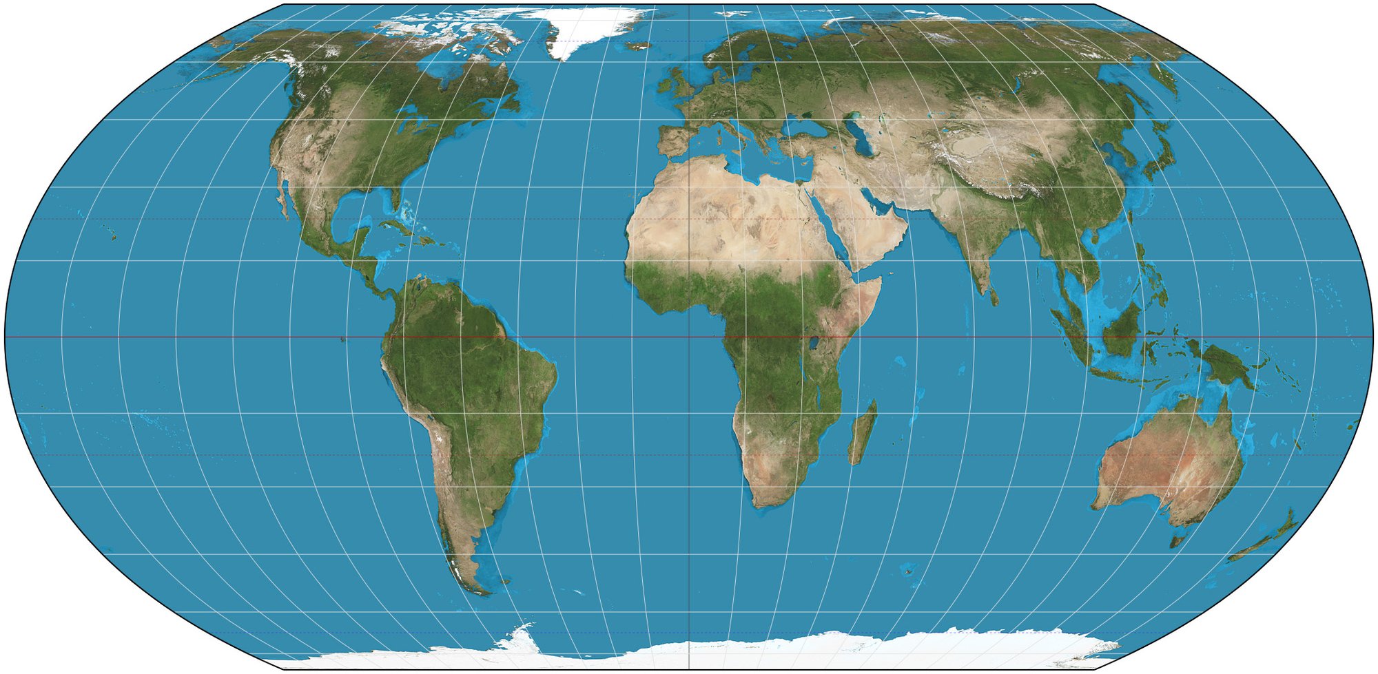
This pseudocylindrical “Equal Earth” projection preserves area and keeps shape distortions to a minimum.
Strebe/Wikimedia Commons (CC BY-SA 4.0)
“Generally speaking, there are no truly ‘perfect’ maps,” cartographer Lorenz Hurni of the Swiss Federal Institute of Technology Zurich told Swiss broadcaster SRF. “This map seeks a compromise to minimize the distortion of the shapes of countries and continents.” That’s why many countries—including members of the African Union—consider it the best possible representation of a world map. The state of Togo therefore introduced the new resolution at the United Nations, entitled “Correct the Map,” on its behalf in an aim to establish the Equal Earth map as the standard.
Although the U.N. flag uses a completely different representation of the world (an equidistant azimuthal projection that has been artistically corrected along the lines of latitude), many hope that the U.N. resolution will gradually be implemented throughout the world, updating the way we look at it.
This article originally appeared in Spektrum der Wissenschaft and was reproduced with permission. It was translated from the original German version with the assistance of artificial intelligence and reviewed by our editors.
