

Here are some figures that are often cited:
The top 1% of Americans hold 32.5% of the nation’s wealth. The next 9% hold 35%. Put those two together and the top 10% has 67.5% of U.S. wealth.
The next 40% of Americans take a 30% share, which leaves 2.5% of the wealth in this great country for the lower 50% of the population.
As disturbing as those numbers may be, it struck me that they miss something. Yes, the 40% that upper middle-class Americans hold is about that same amount of wealth as the superrich one-percenters at the top, but those cohorts are of radically different size — roughly 137 million compared with about 3.4 million people.
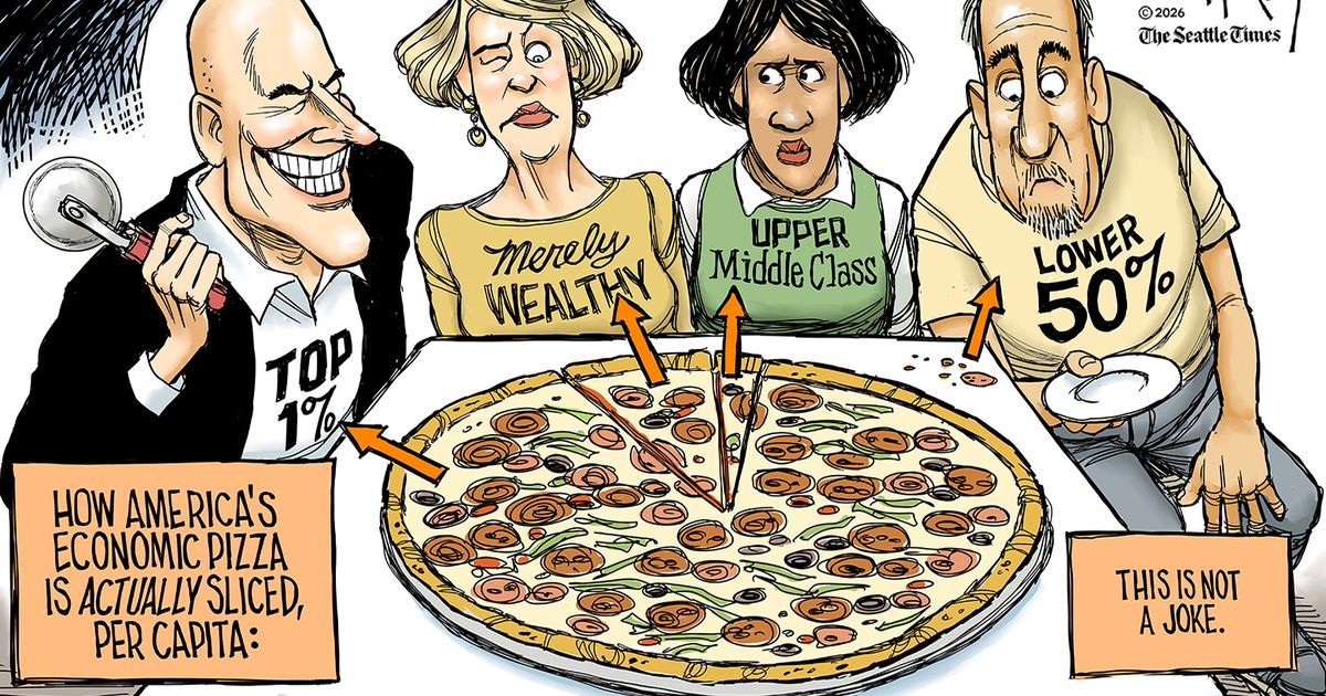
So, I did some simple math — which, for a math-challenged person like me, is kind of amazing — to figure out what share of the economic pizza in my cartoon would go to a single representative person from those different groups if it were based on the average per capita financial situation of individuals in that group.
In other words, if four Americans right in the economic middle of each cohort got together to eat a pizza and the size of their portion were determined by their personal wealth, who would get what?
As you can see in my cartoon, the disparity is even more stark than aggregate numbers indicate.
The guy from the top 1% would get 87.4% of the pizza. The wealthy lady in the next grouping would get only a 10.4% slice, while the woman in the upper middle class would receive a mere 2% sliver.
And the guy representing 50% of the population?
His 0.2% share might get him a bite of pepperoni and a few crumbs of crust.
Now, my numbers are rough, based on the current $196 trillion estimated net worth of Americans and the latest census estimate of 343 million residents in the USA. I took those numbers and calculated how many people would be in each cohort, how much that cohort’s share of national net worth would be and, through wonders of simple division, what the per capita share of wealth would be.
The numbers may not be exact, but they are close. And they paint a picture — or cartoon — that shows, even more starkly, how vast the gap is between the few billionaires at the top and the millions of people in this country who are barely scraping by.
See more of David Horsey’s cartoons at: st.news/davidhorsey
View other syndicated cartoonists at: st.news/cartoons
Editor’s note: Seattle Times Opinion no longer appends comment threads on David Horsey’s cartoons. Too many comments violated our community policies and reviewing the dozens that were flagged as inappropriate required too much of our limited staff time. You can comment via a Letter to the Editor. Please email us at letters@seattletimes.com and include your full name, address and telephone number for verification only. Letters are limited to 200 words.
